





Do you have a hard time choosing colors? Have you ever had to repaint a room because the color you chose didn’t match your expectations at all? Choosing the wrong color is one of the most common decorating mistakes. Here’s how to choose colors you’ll love every time!

Would you rather watch?
Want to listen on the go?
Choosing a paint color can seem like a daunting task, especially if you’ve ever spent hours rolling paint on the wall only to realize it’s just not the right color.
I often say, “It’s just paint” and it can be painted over, but paint, like everything else, has become more expensive and I understand your pain at the loss of time and money.
I’ve chosen the wrong color in the past too. When we moved into this house, I even repainted our master bedroom three times because I was in a rush and forgot my own advice.
But I’ve finally learned how to avoid painting mistakes, and I want to share that with you so you can choose colors for your home with confidence.
How to choose paint colors
Here are my five tips or rules for choosing paint colors like a pro!
1. Don’t choose your colors first!
My most important tip: Don’t choose the color first.
I know sometimes you feel like you have to choose color first because it takes up the most space in a room. The walls are huge. They take up a lot of space, but it’s much easier to choose one of the thousands of colors that matches the other things in your home than it is to choose those things – furniture, decor, rugs, things like that – that match one color.

So always choose the big things first – the flooring, the furniture, the rugs, the curtains, even the artwork – choose those before you decide on the color.
2. Learn at least a little about undertones
My second tip is to learn about undertones and color temperatures.
Paint is made up of different colors. If you have ever watched paint being mixed in the store, you can see all the different colors being dripped into the can.

These create undertones or color temperatures.
- A warm color has the color or undertone of a warm color, such as yellow or red.
- A cool paint color has a base color or undertone of a cool color such as blue, green or even gray.
There are two ways to test the undertone of a color. If you like a color, try this:
Place one or two color samples on a white sheet of printer paper and see which color really becomes visible to you.

(This works especially well with white shades. Read my other blog post to learn how to choose white shades.)
The second option is, if the color is on a swatch with more than one color, look for the bottom color. This is usually much more saturated and therefore will show more of the color’s true undertones, whether they are cool or warm, yellow or pink or something like that.


Being able to see the undertones of a color can make it easier to choose a color that matches your interior design.
3. Never choose your color in the store (NEVER!)
My third tip is: never, never, never, never choose the color in the store.
There is a story I hear all the time. Someone goes to the paint or hardware store and is eager to do a renovation on the weekend and wants to buy paint to begin this rejuvenation treatment. (Mistake number one!)
You have a rough idea of the color you want – perhaps green, blue, red or yellow – but you are not yet sure about the exact color.
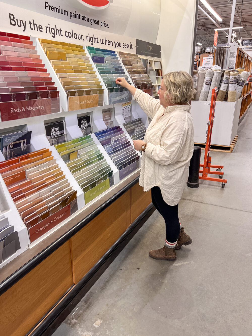
So they go to Home Depot, Lowe’s, the paint store, or wherever.
They stand there and think for a while, looking at all the options, then they choose a color they like and have a liter (or two, or three) of paint mixed, depending on the size of the room.

You can’t wait to get the paint home and start your weekend DIY.
But…
Oh my goodness, the but...
But when they get home and start painting, the color doesn’t look the same as it did in the store. Something is completely different.
The reason is because they broke the MOST IMPORTANT rule, the most important tip I have, even though it’s third on my list:
Never in life, always Choose the colors in the store.
When we choose a color in the store, the question arises as to what type of lighting we are choosing the color under. Fluorescent light – bright and harsh and very different from what you probably have at home.

This lighting, this bright neon light, changes the way the color looks to your eyes in the store and how you see the undertones that we have already talked about.
The color you choose in the store will never look the same in your home, so never choose the same color in the store.
4. Use an inspiration piece
My fourth tip for choosing paint colors is to try an inspirational piece.
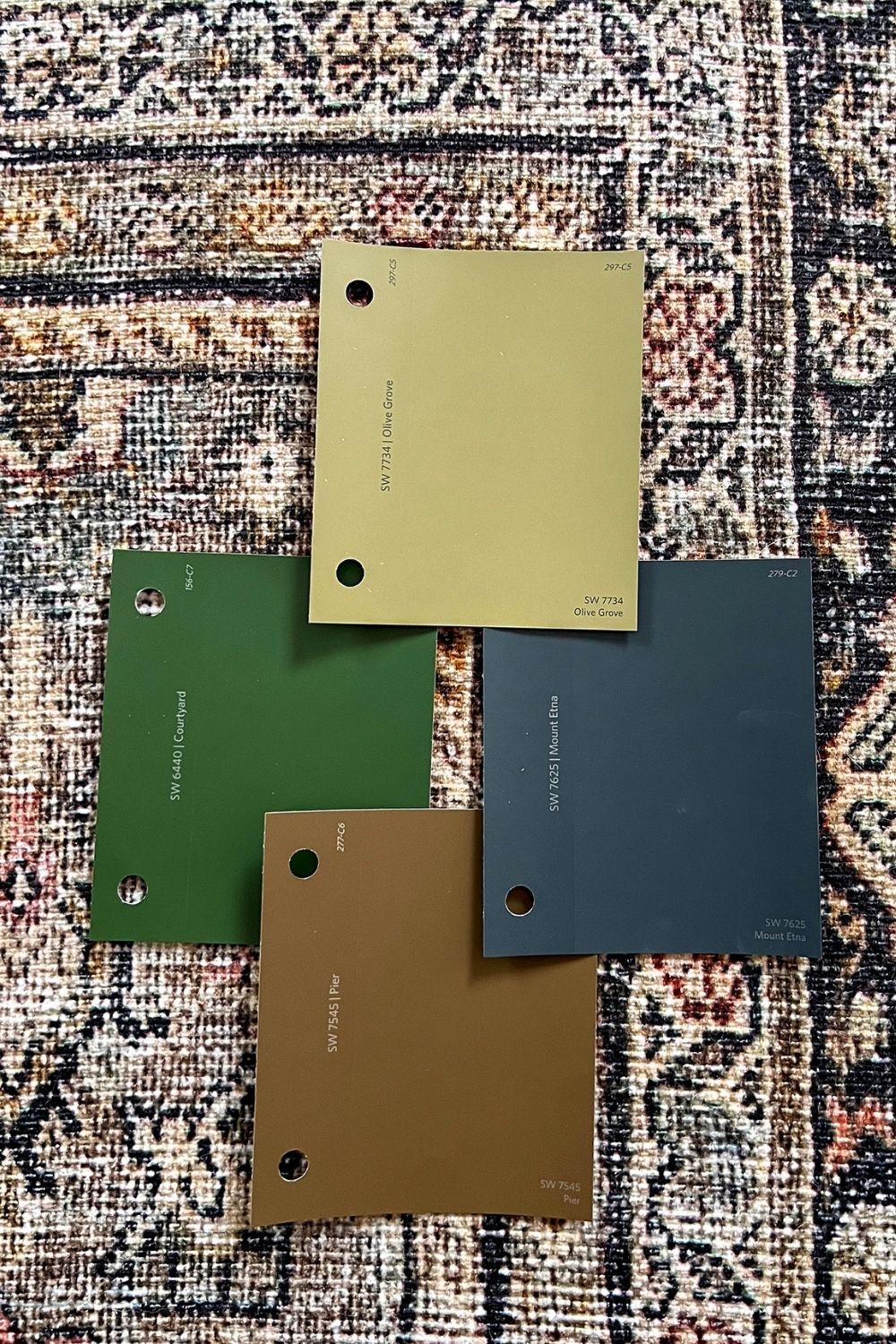
One of my favorite decorating hacks, especially for beginners, is to choose colors for your home that are inspired by a piece of inspiration. This could be a piece of fabric you want to use in the room, bedding you want to use in the room, a rug, a piece of art, or something similar.

When you choose colors from these, you know that they will harmonize with everything else in the room.
This is especially true for the color of the paint, so try to get a piece of inspiration for a color.
5. Use the largest possible test pattern
My fifth tip for choosing colors is to use as large a test sample as possible and test it at home in good lighting.
Take the largest paint samples you can get. Some stores have really large ones. There are also online stores like HelloPaint.ca where you can order stick-on paint samples in the color of your choice. Or you can get sample-sized testers, paint them on a Bristol board, and stick that to the wall.
Look at all those large paint samples or painted Bristol panels in different light. Even move them around the room if you want to see how they look on different walls and how they work in your space.
The lighting in the room – lamps, ceiling lights, etc. – as well as natural light through windows change the appearance of the color pattern at different times of the day.
So live with these large color samples in full light for a few days to see if you really like the color.
The larger the sample, the easier it is to determine which color will best suit your room.
Different rooms and natural lighting
If you are in North America:
- Room facing south will tend to have warmer light due to daily exposure to sunlight. Natural light will be yellowish-white and some colors may appear washed out. Despite this, most colors will work in a south-facing room, but a cooler color may be preferable. To balance out the more yellowish light.
- Room facing north will have cooler blue or gray natural light for those rooms. You can use a cool paint color, but it can still come out cooler and bluer, grayer, and cooler than another room. That’s what happened in my master bedroom. It’s a north-facing window with a pool in the backyard, so the light reflects very, very cool there. A warm paint color will probably be preferable in a north-facing room.
- Rooms facing east and west Lighting will be either warmer or cooler depending on the time of day when the sun is shining over the house, so you can use either warmer or cooler colors in an east- or west-facing room.

Summary
Choosing the right color doesn’t have to be a hassle if you follow these simple tips:
- Don’t choose your color first. Make sure all other decorations are selected before deciding on a color.
- Remember that the color consists of several primary colors and these shine through in the so-called undertones. If you can Identify the undertones Choosing a color will make it easier for you to choose a color that matches your decor.
- Never choose a color in the store because the lighting there will always be different than in your home. Always. So never choose a color in the store.
- Lighting changes the effect of colors. Always test your colours at homein the room you are going to paint and look at it in different lighting at different times of the day before you decide to paint the whole room.
- And if you don’t know which color to choose Match the colors to an inspiration piece such as a rug, piece of art, or fabric that you love and want to use in the room you are painting.
With these tips, choosing the color for your paint job will be much easier.
Related: For more details on choosing the right color gloss, see the article.
Have you ever made a color mistake? How did you fix it? I’d love to hear about your color mishaps and solutions in the comments below!

Podcast